"A Museum, Reborn, Remains True to Its Old Self, Only Better" in @nytimes via Notes from the Bass Museum - George Lindemann Jr

Fred R. Conrad/The New York Times

The new Barnes Foundation, in a new shell in Philadelphia. More Photos »

By ROBERTA SMITH
Published: May 17, 2012

PHILADELPHIA — The Barnes Foundation’s move from suburban Philadelphia to the center of the city caused art lovers lots of worry.

Multimedia

Fred R. Conrad/The New York Times


The west wall of the main room of the new Barnes Foundation in Philadelphia, with Seurat’s “Models” over Cézanne’s “Card Players.” 

Fred R. Conrad/The New York Times

Matisse’s Fauve masterpiece “Joie de Vivre,” in a new spot.

Devotees of this great polyglot collection, heavy with Renoir, Cézanne and Matisse, which the omnivore art shopper Albert C. Barnes amassed between 1912 and his death in 1951, were appalled by the idea. Barnes spent years obsessively arranging his installation cheek-by-jowl in the mansion in Lower Merion, Pa., that he built for the purpose and opened in 1925, and he stipulated that, after he died, it should remain exactly as it was.

In 2002 the foundation’s board — constrained by limits on attendance and public hours imposed by zoning restrictions — announced plans to relocate. Many people, including a group that sued to stop the move, were sure that it could only desecrate this singular institution.

Others, myself included, did not object to the move per se, but felt that faithfully reproducing the old Barnes in the new space, as promised by the trustees, was a terrible idea. To us it seemed time to at least loosen up Barnes’s straitjacketed displays, wonderful as they often were. And why go to the trouble of moving the collection to a more accessible location when the galleries were not going to be any bigger?

And yet the new Barnes proves all of us wrong. Against all odds, the museum that opens to the public on Saturday is still very much the old Barnes, only better.

It is easier to get to, more comfortable and user-friendly, and, above all, blessed with state-of-the-art lighting that makes the collection much, much easier to see. And Barnes’s exuberant vision of art as a relatively egalitarian aggregate of the fine, the decorative and the functional comes across more clearly, justifying its perpetuation with a new force.

As a result, his quirky institution is suddenly on the verge of becoming the prominent and influential national treasure that it has long deserved to be. It is also positioned to make an important contribution to the way we look at and think about art.

Tod Williams Billie Tsien Architects, who pulled off this feat — and somehow managed to avoid the feeling of plastic fakeness that Barnes purists and Barnes skeptics alike were anticipating — deserves our gratitude. The Merion building and its 24 galleries, and Barnes’s arrangements within them, have been recreated with amazing fidelity in terms of proportions, window placement and finishings, albeit in a slightly more modern style. The structure is oriented to the south, exactly as in Merion; the same mustard-colored burlap covers the walls; the same plain wood molding outlines doors and baseboards.

As for Barnes’s arrangements, almost nothing is out of place: not one of the hundreds of great French paintings, none of the pieces of Americana, nor any of the Greek or African sculptures, the small New Mexican wood-panel santos or the scores of wrought-iron hinges, locks, door handles and whatnot that dot the interstices like unusually tangible bits of wallpaper pattern, often subtly reiterating the compositions of the paintings.

The only change to the installation — a big improvement — is the removal of the colorful fantasy of nudes in a landscape that is Matisse’s great Fauve masterpiece, “Joie de Vivre,” from its humiliating position on the stairway landing to a large alcove on the balcony overlooking the main gallery.

At the same time, some major systemic improvements make everything breathe in a new way. Especially important is the lighting system, designed by Paul Marantz, which seamlessly mixes natural and artificial illumination into a diffuse, even light, and had early visitors asking if some of the paintings had been cleaned. (They hadn’t.) There is also the spatial largess: The recreated building is set within a larger structure that includes a raft of amenities, among them a cafe, an auditorium and a gracious garden court with lots of padded benches, as well as a 5,000-square-foot temporary exhibition gallery that pulses with curatorial possibility.

Barnes’s arrangements are as eye-opening, intoxicating and, at times, maddening as ever, maybe more so. They mix major and minor in relentlessly symmetrical patchworks that argue at once for the idea of artistic genius and the pervasiveness of talent. Nearly every room is an exhibition unto itself — a kind of art wunderkammer, or cabinet of curiosities — where you can spend hours parsing the echoes and divergences among the works in terms of color, composition, theme, surface and light.

In Room 4, two Chardins flank a (school of) El Greco beneath 16th-century carved-wood reliefs from France; almost all depict women engaged in various tasks. In Room 14, painted Chinese fans hover beside Matisse’s magnificent 1907 portrait of his wife in a red madras headdress, with a folkish Surrealist painting by Jean Hugo, great-grandson of Victor, positioned above. Several American Modernists make recurring appearances, including Charles Demuth, Maurice Prendergast and William Glackens, a former high school classmate of Barnes’s who turned him on to Modern art; so, to lesser extent, do artists who taught at the Barnes. In front of several Renoirs are wonderful pots by that painter’s son, the future filmmaker Jean.

The twin poles of Barnes’s world are Renoir, represented by 181 works (the largest concentration in the world), and Cézanne, represented by 69. Barnes never seemed to tire of playing these two giants off each other, alternating the fuzzy, sybaritic pinks of Renoir’s forms — whether female or floral — with Cézanne’s anxious, angular blues, greens and rusts, played out in landscapes, still lifes and numerous paintings of bathers, early and late, small and large.

Their back-and-forth dominates several galleries, and the Renoirs are so ubiquitous that at times they seem to become a kind of background noise. That is, until you come up against a great one, like “Leaving the Conservatory,” an imposing full-length grouping of several Parisians dressed in shades of gray that hangs above a predominantly gray-blue Pennsylvania Dutch blanket chest. These wonderful chests, of which there are several outstanding examples, as well as the numerous ceramics, affirm Barnes’s appreciation of painting as a free-range language expressed in various materials, not only oil on canvas.

There are also seemingly endless surprises, like the lone work by the postwar Italian artist Afro in Room 10, which also contains a veritable Matisse retrospective, including a small, early still life that you could swear is a Manet, and numerous works by Picasso and Modigliani.

And there are oddities everywhere that might not pass muster in a more conventional museum, like a European, possibly 15th-century, panel in Room 23, depicting a Flight Into Egypt. The colors are rich, the figures big and wonderfully drawn, but the real life of the picture emanates from the greenery, applied in loose splotches that bring to mind the brushy, sponged-on glazes of American redware ceramics. Looking at the slightly bizarre bits of green, you have no idea if they were part of the original picture or added later, but you don’t care, and perhaps Barnes did not, either. It made a point about continuities of human touch and technique, and he went for it.

In many ways the rebirth of the Barnes could not be better timed. It occurs at a point of intense public interest in art — witness the fact that since the project’s groundbreaking in November 2009, membership has jumped from 400 to nearly 20,000 — and it approaches art with an unfettered directness that is becoming rare among major American museums, of which the Barnes is now one.

At a moment when so many museums seem bent on turning themselves into entertainment and social centers, or frequently mount dry, overly academic exhibitions, the Barnes irrefutably foregrounds art and nonverbal visual experience. The galleries are devoid of text panels and even wall labels; most works have the artist’s last name or some other cultural identification nailed to their frames, and there are printed guides stored in benches in each gallery that identify the works on view.

Audio guides will be available, but really, there is nothing to do here but look at art and think for yourself. The dense clusters and juxtapositions provide more than enough to work with: a visual deluge of forms — in different mediums and materials, from widely spread times and places — that make looking and thinking reflexive, rapturous and liberating.

At the same time, the relocation of the Barnes, with all its mixings and juxtapositions, comes at a time when curators of all kinds — from museum professionals to artists organizing gallery group shows — are increasingly interested in cross-cultural, cross-medium presentations of artworks. In this regard the Barnes looks utterly prescient.

And let’s not overlook the implications of that temporary gallery, which is opening with an exhibition about Barnes’s life and the history of the foundation. This space creates the possibility of a new flexibility with regard to the meticulous re-creation of the Merion galleries. They suggest that the Barnes may be able to have its cake and eat it too, hold on to its past and also forge a new future.

Barnes purists may consider this heresy, but Barnes’s installation should sometimes change and move a little. There are moments, especially in the upstairs galleries among the plethora of drawings and Greek and African objects, where the presentation palls and oppresses a bit, even now. The symmetrical patchwork doesn’t always come across as meticulously assembled; it can seem arbitrary and maniacally crowded. More generally, there is simply too much there for everything to remain in perpetual lockdown.

The Barnes curators need to come up with creative ways — say for two or three months, every other year — to extract certain works from the gallery collection, walk them across the garden court and put them on view in the temporary-exhibition galleries for less encumbered viewing. Set out all the African works, for example. Give us a Cézanne or a Matisse retrospective. Or a survey of the Pennsylvania Dutch blanket chests and related Americana whose hues and surfaces Barnes was so alive to.

Barnes did so much, more than he was capable of knowing. We can know how much only if his orchestrations are taken apart and rearranged ever so slightly and briefly, once in a while. It is great that Tod Williams and Billie Tsien, the architects, adhered to his vision so sensitively, providing a kind of unwaveringly accurate baseline. But every so often the pieces of even his most revelatory ensembles should be freed from his matrix, just as his amazing achievement has been liberated from Merion.

The Barnes Foundation is at 2025 Benjamin Franklin Parkway in Philadelphia; (215) 278-7000. It is open Wednesday through Monday from 9:30 a.m. to 6 p.m., except Friday, when it stays open until 10 p.m. For reservations and information, go tobarnesfoundation.org.
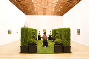
"When a Ticket-Taker and Turnstile Aren't Enough; Brooklyn Botanic Garden Visitor Center" By Julie V. Iovine - WSJ.com

[botanic]Albert Vecerka / Esto

Aerial view of the Brooklyn Botanic Garden's new Visitor Center, designed by Weiss/Manfredi architects.

The firm's virtuosity and elastic approach to design are on full display at the Brooklyn Botanic Garden Visitor Center, which opens this Wednesday. A sinuously shaped structure, half-bermed into a hillside with a green roof of crew-cut grasses, the center combines architecture and landscape (plus some heavy-duty engineering) with the mobile harmony of a ballet.

Which is also to say that it doesn't photograph easily or lend itself to a single impression or "take." Seen from its Washington Avenue side, the Visitor Center presents a modestly elegant concrete-and-glass façade with a twice-pitching copper roof to blend in with other Brooklyn Botanic Garden buildings along the street, such as the rather grand McKim Mead & White Administration Building. On the parking-lot side, the Visitor Center drops any notion of formality with the curvaceous glass walls of two pavilions adjacent but not touching—like two swirling eddies—luring the visitor along a glass-covered path wending inexorably into the gardens.

The 480-foot-long larger pavilion contains orientation exhibits, offices, a catering kitchen and a leaf-shaped event space. Aerial views clarify its tadpole-like shape and the way it undulates along and merges with the hillside, while the smaller, more rectangular-shaped pavilion containing the gift shop faces the street.

The experience of strolling through the entire center is seductively baffling, and never more so than when climbing an exterior stair that runs up the larger pavilion to an overlook on the garden side. It's a climactic moment because at the entrance plaza the building seems to be a one-story structure, but from the top of the stairs you find yourself on an unexpected terrace passing under the green roof and meandering toward terraced gardens on the hilltop itself with far-flung views of the entire 52-acre garden.

When did visitor centers become such orchestrated events? Time was when a ticket-taker, turnstile and stack of brochures with maps—pretty much what greeted visitors at this spot in years past—were sufficient to the task of welcoming the uninitiated. Today's increasingly ubiquitous visitor centers serve a much more ambitious purpose: to demonstrate with instant legibility the DNA of the host institution. Architecture, graphics, program announcements, the gifts in the gift shop and even the tiles in the bathroom—here colored with pixelated plant images—must all telegraph the same core message.

The Brooklyn Botanic Garden, entering its second century, is hardly a novice at branding, but at the new Visitor Center it is exercised with comprehensive aplomb. On the entry plaza, even before one buys a ticket, the sustainable landscape lessons begin with two planting beds—sprouting black gum trees, wild hyacinth and water-loving grasses—that are sunk into the pavement and operate as storm-water basins channeling overflow to the nearby Japanese garden pond rather than into New York's sewer system. Similarly, the green roof (designed, as were the rain gardens and other landscape elements, by HM White) is no small engineering feat. With a pitch of up to 27 degrees, it requires complicated networks of special soils held in place with cleats and geo-nets involving drip irrigation systems woven into capillary fabrics, and other impressive techniques with specialized vocabularies known only to au courant gardeners. It almost goes without saying that such a state-of-the-landscape building is heated and cooled geothermally.

The $28 million Visitor Center is one of three entrances to the Brooklyn Botanic Garden, where some 725,000 people visit a year. It makes no grand architectural statement, preferring to realize in every possible detail the message and the mission of the Brooklyn Botanic Garden—even the paneling inside was harvested from a Ginko on the site. And that calls for a collaborative partnership of the highest order.

Ms. Iovine writes about architecture for the Journal.

My brother's Observer article..."Karen Kilimnik’s Teenage Dream" @AdamLindemann

Karen Kilimnik’s Teenage Dream
May 16, 2012

I’ve always favored macho art, art that packs a solid dose of testosterone. My art collecting alter ego, whom I’ve dubbed Duc Jean des Esseintes, and who has curated the inaugural exhibition at my new gallery, Venus Over Manhattan, also preferred big, bold statements—large outdoor sculptures, super-sized paintings, almost anything oversized and impractical. Des Esseintes’s exhibition, called “À Rebours,” is named for and based on a 19th-century novel that describes Des Esseintes’s strange life of art collecting and indulgence, as well as his obsessions with poetry, absinthe and decadence. In his/my show, artworks by French 19th-century symbolist masters are intermingled with those of contemporary artists young and old, in ways both tasteful and tasteless.

Neither Jean nor I ever liked girly art, those petite paintings in fancy frames and fussy works on paper, so it’s no wonder that the work of Karen Kilimnik was never very interesting to us. All I could see in it were frilly pictures of castles and bunnies, and a silly and bad portrait of Paris Hilton dressed as Cinderella. Why, I asked myself, would any painter make work that is willfully wan and whimsical, and that comes across as badly painted, even feeble? The work looked to me almost as though it were designed for failure.

Then, in the summer of 2005, I had a Kilimnik epiphany in the Bevilacqua la Masa Foundation, a palace in Venice that serves as an art venue during the Biennale. Ms. Kilimnik had been invited to take over the entire building with an installation, and the magic she created inside that beautiful but decrepit old palace changed my understanding of her work. I remember walking in and hearing the sound of birds chirping and espying, in the corners, little nests with plastic eggs and fake fuzzy bunnies. She’d strung the chandeliers with pastel colored ribbons, and made paintings of handsome princes and princesses arrayed in 18th-century splendor, surrounded by horses and gardens, castles and lavish interiors, all in the style of some bad painter who worked in a 19th-century mode and mixed present-day celebrities with ancien régime fairy tale whimsy. Ms. Kilimnik’s mad visions cast Leonardo DiCaprio as a prince, Kate Moss as a Park Avenue princess; she brought in Emma Peel, Scarlet Johansen, Nureyev. Hers was a fully kitsch-ified, candy coated world that looked saccharine at first, but that revealed itself, on closer inspection, to be dark and disturbing.

In fact, Ms. Kilimnik is not a traditional painter at all, she is an installation artist, much like her contemporary, the revered and cultish Cady Noland. This has caused much confusion in parts of the art world, especially when we consider a much younger painter, Elizabeth Peyton, whose masterful portraits of celebrities and art world characters have often been compared to the historical or celebrity-derived works of Ms. Kilimnik. In this comparison Ms. Kilimnik invariably loses because she can’t compete with the masterful brightness and ice cream smoothness of Ms. Peyton’s canvases. But dig a little past the surface and you’ll find this comparison is myopic and non-sensical. Ms. Kilimnik’s paintings must be seen as part of her installations. They are images from an imagination that never reached puberty, and they are not competing with the classic portraiture by the likes of Ms. Peyton, even if, occasionally, their subject matter overlaps.

And so the brand new Kilimnik exhibition at the Brant Foundation in Greenwich Connecticut is a welcome and timely one because it convincingly presents the full range of her oeuvre. Seeing a single painting reproduced in an auction catalog or hanging in an art fair has never done justice to her work, and almost all the gallery shows I have seen are chock full of sellable paintings but lack the chandeliers, the music and empty perfume bottles that are needed to complete her storytelling.

Mr. Brant’s support and patronage are significant in this regard. He is a seasoned collector who as a young man in the 1960s bought paintings from Andy Warhol and learned about connoisseurship from Bruno Bischofberger, the fabled Zurich-based dealer/investor/collector. A man of many talents, Mr Brant excels at squash and tennis, but in sports he is best known for his polo team White Birch Farm, which dominated US polo for over a decade (I did, however, manage to beat him a couple of times). The patrons of this show are a powerful businessman/art collector and his iconic supermodel wife (Stephanie Seymour); the setting is a beautiful old stone barn abutting polo grounds that have hosted the world’s best and most famous players—there is, in other words, arguably no better fantasy context in which to see Ms. Kilimnik’s work.

The show, which encompasses the entire Brant Foundation, includes an indoor garden as well as chandeliers, birds, landscapes paintings, the requisite portraits and several installations. It’s the first time since Venice that I’ve seen the full spectrum of Kilimnik’s creative output in one place. As such, it is a wonderful testament to her singular dream—or neurosis, depending on how you choose to read it. I came to love the work when I stopped focusing on the pictures and started thinking about the ideas. We are all to some extent locked in our childhood fantasies, whether fond memories of youth or the prison of those painful teenage years, and the effects of formative experiences stay with us, through nostalgia, or longing and melancholy. There is sadness in Ms. Kilimnik’s work, but I also see the childish joys and excitements of adolescent fantasy, even if it is filtered through the mind of a 56-year-old woman.

In my eyes Ms. Kilimnik’s oeuvre is a world unto itself, a strange, kitschy parenthetical expression in contemporary art. I don’t bother comparing her to her art star peers. For most of us, our private fantasies exist in the further reaches of our consciousness. Karen Kilimnik’s are right on the surface: like Peter Pan, she never grew up, and she never will. This show is a tour de force, so “Brava” to you, Ms. Kilimnik, I hope lots of people make the effort to get up to Greenwich to see just how good it all looks.


"Maria Pergay designs the 'T' for New York Times Summer Design Issue"

Photo: Stephen Lewis
Artwork by Maria Pergay

Infinite Possibilities
May 3, 2012

The Russian-born French designer Maria Pergay created a gleaming ‘‘T’’ out of stainless steel and topped it with a diamond. ‘‘I tried to do it justice,’’ says the 81-year-old artist, who is known for her avant-garde metal furniture. Pergay got her start as a window dresser and says she has a ‘‘big appetite’’ for materials like wood, silver and, especially, stainless steel: ‘‘It is incorruptible, perfectly strong and feminine.’’ In addition to her recent retrospective in Paris, Pergay, who was inducted into the Legion of Honor in February, will celebrate her 55-year career with an exhibition of new and old work at Design Miami/Basel in June.

What was your inspiration for this T?

I was inspired by the Times’s “T” itself, the very old and majestic style of the gothic font and its sense of history.

How long did it take you to create the T?

I sketched for 20 minutes, but it took me 18 full days to execute the project.

How tall is the T? What everyday object is it comparable to, size-wise?

The letter stands more than 50 centimeters tall, about 20 inches.

What made you integrate the infinity sign into this piece?

Logic.

What symbolizes infinite possibility to you?

The universe.

What about the jewel? What inspired you include the diamond?

I’m drawn to diamonds. Diamonds are eternal.

What first drew you to working with stainless steel?

The Flying Carpet Daybed, which I made in 1968, was my first foray into stainless steel. I’ve been working with the material ever since then.

What was the biggest challenge you faced in this project?

How to express myself.

What do you love about your work?

I like its exigence. Happiness comes from paying attention to and obeying artistic urges.

What is unusual about this T?

Your questions.

Fill in the blank: T stands for _______________.

Maria.

CornellNYC Chooses Its Architect

After a competition that included some of the world’s most prominent architects, Thom Mayne of the firm Morphosis has been selected to design the first academic building for Cornell University’s high-tech graduate school campus on Roosevelt Island in New York City.

Ruth Fremson/The New York Times

Thom Mayne

“The goal here is to develop a one-of-a-kind institution,” Mr. Mayne said in an interview at his New York office. (Morphosis also has an office in Los Angeles.) “It’s got to start from rethinking — innovating — an environment.”

The building will get extra attention as the first part of an engineering and applied-science campus charged by Mayor Michael R. Bloomberg with spurring New York City’s high-tech sector. It needs to embody the latest in environmental advances and to incorporate the increasingly social nature of learning today by creating ample spaces for people to interact. And to succeed, Mr. Mayne said, it must visually connect to the rest of the city, because its setting is surrounded by water.

Mr. Mayne has grappled with academic buildings before, perhaps most notably one for the Cooper Union for the Advancement of Science and Art in the East Village, completed in 2009, whose concave facade is clad in a perforated metal screen and punctuated by a vertical gash.

Mr. Mayne said the Cornell project presented an opportunity to contemplate what an academic building should look like in the information age. Should it have the bullpen environments of tech start-ups or the more cloistered layout of established universities? How should it use space to foster collaboration while also carving out areas for quiet reflection?

“There is no modern prototype for a campus,” Mr. Mayne said. “You have to have a completely different model which has to do with transparency and exposing social connectivity and breaking down the Balkanization that happens departmentally.”

There are no snazzy architectural images yet, nor can Mr. Mayne speculate about what shape the building will take or what materials he might use. “I haven’t even seen the site plan yet,” he said. The only certainty is that Mr. Mayne will not inaugurate Cornell’s new campus by designing some kind of ivory tower.

“I like being able to tell you that I don’t have any bloody idea what it’s going to look like,” he said.

Daniel P. Huttenlocher, dean of the new campus, to be called CornellNYC Tech, and a Cornell vice provost, said that as a computer scientist, he was “very sympathetic to the form-follows-function view of the world” and that he was “heartened by an architect who doesn’t want to get too caught up in the form too early in the process.”

At the same time, Cornell is in a hurry, having pledged to have classes up and running by September in leased space in Manhattan (location to be announced). The Mayne building is expected to break ground in 2014 and to be completed by the start of the 2017 academic year.

Mr. Mayne’s building is part of a campus that will be developed over two decades. The campus will comprise more than two million square feet of building space at a cost of over $2 billion and will serve more than 2,000 students. It will include three academic buildings; three residential buildings; three buildings for research and development; and a hotel and conference center.

In December Cornell, in partnership with the Technion-Israel Institute of Technology, won the yearlong competition to build the campus, beating teams that included one from Stanford University and City College of New York.

The master plan is being designed by Skidmore, Owings & Merrill, which was among the six finalists for the Cornell campus. The others were Rem Koolhaas’s Office for Metropolitan Architecture, Diller Scofidio & Renfro, Steven Holl Architects and Bohlin Cywinski Jackson.

Mr. Mayne’s 150,000-square-foot building is expected to cost about $150 million, Mr. Huttenlocher said, which will be covered by a $350 million gift through an alumnus. The city is providing $100 million in infrastructure improvements, as well as the land on Roosevelt Island, currently occupied by a little-used hospital. The new building will include classrooms, laboratories, offices and meeting space.

Morphosis was chosen partly because of its track record of completing projects on time and at a reasonable cost, Mr. Huttenlocher said. “We can’t afford for the budget to be something that balloons out of control,” he added.

The campus is designed to bring academic and private-sector research and development together to speed the translation of academic work into usable products and services.

Mr. Mayne said he would start by talking with the engineering firm Arup about how to design a building with zero-net energy consumption that will use and produce geothermal and solar power.

While the building’s design should be arresting, Mr. Huttenlocher said it also must satisfy its tech-savvy generation of users, who will adapt the space to their needs if it fails to suit them.

“If the building didn’t function well, I think it would get hacked to pieces,” Mr. Huttenlocher said. He added that Cornell liked Morphosis’s “ability to create iconic structures whose form does not obscure or impede its program.”

Mr. Mayne said he designed spaces that were meant to be personalized and “not in any way pristine.”

Morphosis tries to create spaces that allow work to happen in the most effective way possible, Mr. Mayne said. “After that,” he added, “we should stay out of the way.”


"Art Basel Sheds Light on Its Asia Plans" in @wsjonline

Art Basel Art Basel co-directors Annette Schönholzer and Marc Spiegler

This year’s Hong Kong International Art Fair is a week away, but its organizers are already focused on 2013.

That’s when the event — Asia’s biggest and most lucrative art fair — will be reborn as the Hong Kong edition of Art Basel. It will be held May 23 to 26 and remain at the city’s convention center.

Associated Press
Paul McCarthy’s ‘Daddies Tamato Ketchup Inflatable 2007′ at the entrance to the Hong Kong International Art Fair in 2011.

Marc Spiegler, co-director of Art Basel and sister event Art Basel Miami Beach, the biggest art fair in the U.S., said there will be “significant differences from this year” but declined to share details. MCH Group, which owns both Art Basel fairs, bought a 60% stake in Hong Kong’s fair last May.

Exhibitors, however, will get some idea of what’s changing on June 11, when Basel releases information on the selection committee and makes its 2013 applications available.

Among galleries’ concerns: that Art Basel Hong Kong will feature the same names that pop up in the U.S. and Europe. That won’t happen, Mr. Spiegler said.

“Every gallery has to apply every time to every show,” he said. “We want [to avoid] shows that all look the same. There will never be a get-in-once, get-in-three times concept, though that would make our lives simpler.”

Magnus Renfrew, the Hong Kong art fair director who is now Art Basel’s director in Asia, said the fair is committed to keeping a 50-50 split between Western and Asian (which they define as including the entire Asia-Pacific region as well as the Middle East and Turkey) galleries.

WOW Productions - Magnus Renfrew

What patrons can expect is to see top-selling Asian artists and galleries appear in Miami and Basel, similar to Art Basel Miami, which raised the profiles of Latin American artists, who were then invited to Switzerland. “There is cross-pollination,” Mr. Spiegler said.

In an effort to cultivate Asian collectors, Art Basel has hired VIP relations officers in Shanghai, Singapore and Sydney, and is seeking representatives in Beijing and Taipei.

“This kind of high-touch approach is important,” said Mr. Renfrew.

While the May date is conveniently near Hong Kong’s spring auctions, it’s not ideal for overseas collectors and galleries, who are already hopping from Frieze in New York to Art Basel in Switzerland this time of year.

Mr. Spiegler cited the logistics of booking Hong Kong’s convention center, which is packed with trade shows and other events in the spring. “This is an issue we’ve been working on,” he said.

Follow Alexandra A. Seno on Twitter @alexandraseno


"Art That Dissects the Pretty: Karen Kilimnik's Art Is on View at Brant Foundation, Greenwich, Conn." in WSJ.com

Feathery blue skies, pheasants, puppies and pretty youths: Many of Karen Kilimnik's paintings read like an adolescent's fanciful dreams.

But fans and curators see more than that. Ingrid Schaffner, senior curator at the University of Pennsylvania's Institute of Contemporary Art in Philadelphia, says the artist's work is akin to the ballet, "something that looks so beautiful," with "these women who appear to be suspended in a permanent adolescence but are in fact hardworking, disciplined artists." (Ms. Schaffner organized a 2007 Kilimnik show.)

[ICONS kilimnik]303 Gallery, NY and Galerie Eva Presenhuber, Zurich

Karen Kilimnik's 1998 'Prince Albrecht at Home...' will be on view in Greenwich, Conn.

The artist's imagery is lifted from cult TV shows, 18th-century French paintings, foreign fashion magazines and celebrity promo stills.

A solo exhibition of Ms. Kilimnik's work begins this weekend through September at the Brant Foundation Art Study Center in Greenwich, Conn. (guided tours open to the public by appointment). The show's 60 paintings, drawings and installations are all from the collection of the museum's founders, paper magnate Peter Brant and his wife, the onetime supermodel Stephanie Seymour.

In a phone interview, Ms. Kilimnik herself seems a sweet and shy embodiment of her work. Born in Philadelphia sometime in the 1950s (she's mum on precisely when), she studied architecture at Temple University, worked odd jobs and, ultimately, plied New York dealers with letters and postcards in an effort to get them to show her artwork. Ms. Kilimnik cited a few of her key influences (animal portraitists Sir Edwin Landseer and François Desportes) and explained her paintings' signature small scale: "I couldn't afford anything, I didn't have much room, and I like to work on my own."

Her painting of Leonardo DiCaprio, "Prince Albrecht at Home at the Castle on School Break," sold at Christie's London for $533,117 in October. It's in the Brant Foundation display.

—Rachel Wolff

A version of this article appeared May 5, 2012, on page C14 in some U.S. editions of The Wall Street Journal, with the headline: Art That Dissects the Pretty.


Fakes are a serious problem..."Diebenkorn Family Says It Warned Knoedler on Drawings"

R. C. Kemper Charitable Trust
A drawing said to be by Richard Diebenkorn that is in dispute.

A few months after the abstract painter Richard Diebenkorn died in 1993 his family visited Knoedler & Company, the gallery on the Upper East Side of Manhattan that had long been his dealer. His wife, Phyllis; his daughter, Gretchen; and an art scholar went to see two gouache drawings that the gallery had recently acquired and that it hoped to sell as works from Diebenkorn’s celebrated Ocean Park series.

What happened at the meeting nearly two decades ago is now a matter of dispute, one that has only grown in significance as the gallery, once venerable and now closed, battles accusations that it sold many works of modern art that were actually sophisticated forgeries.

The Diebenkorn family says it made it plain that day, before the drawings were sold, that it suspected the drawings were fakes.

“They didn’t look quite right, and we said, ‘The provenance is wacky and the story behind the provenance makes no sense,’ ” said Richard Grant, the artist’s son-in-law and the executive director of the Diebenkorn Foundation.

The gallery and its former president, Ann Freedman, say the family embraced the drawings as legitimate.

“We have definitive documentary evidence,” said Nicholas Gravante Jr., Ms. Freedman’s lawyer, including a copy of a 1995 letter from the gallery to the family members “confirming that they had viewed and authenticated the works Ms. Freedman showed them as being by Diebenkorn.”

For months Knoedler has been buffeted by accusations that it failed to check sufficiently the authenticity of more than 20 paintings it promoted as the work of Modernist masters. Now, in the matter of these Diebenkorn works, Mr. Grant said that Knoedler intentionally overlooked adverse information in order to sell the two drawings, and perhaps eight others, that he says it wrongly attributed to Diebenkorn. Most of them were not shown to the family, he said.

While the gallery and Ms. Freedman deny the accusations, the art scholar who accompanied the Diebenkorn family that day in 1993 said he could confirm the family’s account. “This was a long time ago, but I can remember standing in the room at Knoedler, particularly Phyllis and I looking at them,” said the scholar, John Elderfield, a former curator at the Museum of Modern Art who still assists the family in reviewing artworks. “We did express doubt.”

The drawings in question were two of five sold by Knoedler as Diebenkorns that came from a man who would not say where he had gotten them, Mr. Grant said. The family also disputes the authenticity of another five drawings that Knoedler sold in the 1990s as part of the Ocean Park series and were said to have come from a second source, a Madrid gallery called Vijande, now shuttered.

Knoedler and Ms. Freedman declined to discuss the Diebenkorn matter, including the provenance of the drawings or how many were sold.

Disputes have been piling up for Knoedler since it closed five months ago. Two former clients who bought paintings attributed to Jackson Pollock and Mark Rothko have sued the gallery separately, saying that the works are fakes that did not pass forensic analyses they commissioned, and that they have cloudy provenances. The clients are seeking $42 million.

Those paintings and about 20 others attributed to Modernist artists were brought to the gallery by a little-known Long Island dealer, Glafira Rosales, whose transactions are now the subject of an F.B.I. investigation. Ms. Rosales has said through her lawyer that she never knowingly defrauded anyone.

Ms. Freedman has said that Ms. Rosales told her the paintings came from a previously unknown cache acquired by a secret collector in the 1950s. No paperwork from these transactions has surfaced.

Ms. Freedman has testified in court that she continues to believe the Rosales paintings are authentic. Her lawyer, Mr. Gravante, said they have spoken to experts who will back that assertion at trial.

“Just last week we received another expert opinion confirming the authenticity of those works,” he said. He declined to provide the expert’s name.


"Young at Art Museum’s new digs inspire young minds" in @miamiherald via Notes from the Bass Museum - George Lindemann Jr,


Kevin Druckmann, 5, of Palmetto Bay, jumps through a beaded art frame amid a wall of child producted replications of famous artworks at the new $26 million Young At Art Museum in Davie for children. Hundreds of children and parents flocked to the place Saturday at 751 SW 121st Ave. just off State Road 84 for the long awaited grand opening day. EILEEN SOLER / FOR THE MIAMI HERALD

IF YOU GO
What: Young At Art Museum
Where: 751 SW 121 Ave. Davie, FL 33325
Cost: $13 for adults, $12 for seniors and children, and $11 for Broward County residents.
Information: 954-424-0085 or YoungAtArtMuseum.org.

BY MARIA CAMILA BERNAL

MBERNAL@MIAMIHERALD.COM

MiamiHerald.com

Four-year-old Yasmeen Buchheit could not contain her happiness in front of a four-foot-tall wax cylinder. In her hand was a small utensil she was using to carve and shave designs into the wax.

“This is my favorite thing so far! It looks like a big candle and I’m going to blow it out like in a birthday cake,” said the kindergartner who visited the new location of the Young At Art Museum in Davie, “I want to come back 50 times again!”

The Young At Art Museum first opened in 1989 in Plantation, after Mindy Shrago, artist and CEO of the museum, realized there was no place where children could go to be artistically inspired.

“My mom and I sat down to think about what we could do to help this community broaden the arts and fill the void for the lack of arts in Broward County,” said Shrago. “That’s how we started Young At Art.”

The museum opened at a new location on Saturday, making it their third move.

“This is like Disney World,” said Weston resident Katina Taylor, who brought two of her kids to the museum. “Having indoor activities for the summer when it’s hot is a dream come true for parents.”

The new $26 million facility includes the museum and the Broward County Library at Young At Art, the first Broward County Library location that is exclusively focused on kids.

“We work in cooperation rather than competition,” said library branch manager, Gina Moon.

Broward County purchased the land and leased the space to the Young At Art Museum. The partnership began in 2002 and according to Shrago it was just a natural fit. “It was a win-win partnership to be able to infuse art- and literacy-based learning,” she said.

The library is free but there is an admission fee for the museum, which includes access to its four permanent art galleries designed for children and adults.

“It was a tiny museum before. This one is completely different — it’s hands-on and colorful,” said Virginia Engestrom who brought her 10-year-old son and two neighbors. “The museum is perfect.”

Each of the four galleries has a specific theme including WonderScape — an area dedicated specifically to toddlers and children under 5 that helps them learn through art, literacy and play.

Weston resident Tia Dubuisson loved taking her 2-year-old and a 4-year-old to the early childhood area.

“They have very practical ways of making amazing happen,” Dubuisson said.

The other three galleries include GreenScapes, a gallery that calls attention to environmental issues and incorporates go-green activities; CultureScapes, which incorporates contemporary artists works and is home to Making Waves — an 18-foot structure that allows kids to climb and explore inside the wave-like play area; and ArtScapes, a gallery that takes kids on a fun and educational journey of art history.

The museum is designed for all ages and even older kids enjoy the activities. Mark Halavin lives in Cocoa Beach, but was visiting his family and decided to bring his 13-year-old son to the museum.

“It was very wonderful, all the exhibits were fun and exciting to see,” said Noah Halavin, who is in the sixth grade.

The museum also includes areas for workshops, where fifth-grader Jessica Ortiz was making paper mache.

“I have lots of fun here — the other museum was not as fun as this one,” said Ortiz, 10, from Fort Lauderdale. “The activities here are cool and I can play.”

The galleries in the museum include art from more than 60 artists including Pablo Cano, a Miami-based artist who created a marionette theater, gallery and workshop for the museum.

“It’s not just for kids, it’s for adults and artists. This museum incorporates fine arts,” said Cano who described the museum like a sanctuary for arts and culture.

Approximately 3,000 children and adults visited the museum Saturday. Although Shrago said she feels satisfied and inspired, she said her work is never done, and that she is looking forward to the summer.

“We spent so much time in the planning, that we know we will become a model for other museums and for the generations to come,” said Shrago. “There is so much more around the corner at Young At Art.”