"YoungArts to move into Miami’s Bacardi complex" @miamiherald

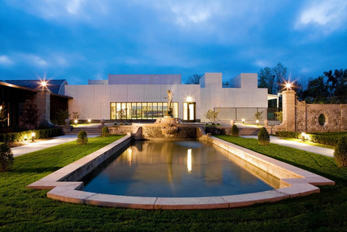
The National YoungArts Foundation has purchased the famous Bacardi complex in Miami, with plans to create — with Frank Gehry’s help — a new center of arts activity.


A pair of historic, glittering buildings sat empty beside a busy Miami thoroughfare. An arts foundation with a nomadic background was looking for a place to plant permanent roots and expand.

That is how the National YoungArts Foundation, founded 31 years ago by Ted and Lin Arison, came to find its new home: the iconic Bacardi Tower and Museum complex along Biscayne Boulevard. The campus will get a Frank Gehry-designed master plan and year-round programming to link downtown’s burgeoning arts scene with the hip Wynwood and Design District neighborhoods.

Officials with the organization and company will announce the news Wednesday.

“This was really, I believe, a match made in heaven,” said Paul T. Lehr, executive director of YoungArts. “There was no better place for us to go and there was no better purchaser for this campus than us and what we were going to do.”

Lehr said Bacardi U.S.A. sold the 3.3-acre site at 2100 Biscayne Blvd. to the foundation for $10 million, though the market value was over $20 million. The blue and white tiled tower, by architect Enrique Gutiérrez, was completed in 1963. The mosaic square known as the “jewel box,” designed by Ignacio Carrera-Justiz, was added in 1975.

They were designated as historic in 2009 by Miami’s historic preservation board.

Facundo L. Bacardi, chairman of the board of spirits producer Bacardi Limited, said the sale wasn’t about making money. The privately held company moved its Americas headquarters to Coral Gables in 2009 and has maintained the Biscayne Boulevard site but used it only rarely.

When Lehr approached him with the idea about nine months ago and discussions started within the company, “it was kind of like a light bulb went off,” Bacardi said.

“We were looking for somebody to extend the legacy of the property and how much it means to us,” he said. “I don’t think we could’ve come up with a better partner.”

While closely guarded, the news had been shared with some YoungArts supporters in recent days. Reactions were enthusiastic.

“It’s not only a milestone in Miami’s evolution as a cultural community, I think it’ll be a powerful magnet for talent for decades to come,” said Alberto Ibargüen, president and CEO of the John S. and James L. Knight Foundation, which has supported the organization. “The whole thing just strikes me as perfect for a cultural center for this town.”

Despite working with more than 16,000 students over the last 31 years — including alumni like Vanessa Williams and Nicki Minaj, who have become household names — YoungArts has kept a relatively low profile. The organization finds and nurtures artists 15 and older, bringing in 150 a year for a week of intensive classes with masters in their field.

Even with its new home, the foundation is also planning a huge expansion of activities beyond Miami, including year-round events in New York, a Los Angeles version of Miami’s YoungArts Week and continued presence in Washington as the only nominating agency for the Presidential Scholars in the Arts.

“It’s all coming together at once,” Lin Arison said. “That’s because it’s meant to be. We’ve been doing our quiet work for 31 years, and now it is going to become visible.”

As the foundation expands nationally, it has added Gehry, singer Plácido Domingo and dancer, choreographer and director Bill T. Jones as artistic advisors. And it has added a 10th discipline, architecture and design, to a lineup that includes cinematic arts, dance, jazz, music, photography, theater, visual arts, voice and writing.

And its YoungArts MasterClass television program, which has appeared on HBO, is being used in public schools in Miami, New York and Los Angeles with a teachers guide so educators can use lessons from mentors in their classes.

Arison, who said she sold paintings by Claude Monet and Amedeo Modigliani to support the move, envisions the new campus as a place where visual arts by alumni will be displayed year-round, popular art walks in the nearby Wynwood district will spill over and outside projections like the well-known wallcasts at the New World Center will take place. Gehry designed the new Miami Beach home for the New World Symphony, which the Arisons co-founded.

“Once people get in here, they’re going to own it,” Arison said. “The kids are going to own it, the mentors are going to own it and hopefully the community is going to own it.”

While YoungArts will move its administrative headquarters into the new building by mid-October, the timeline for the rest of the project was not yet known. Mentors in the program will be asked for input on how the space should be used, and Gehry will involve students in the overall design of the campus.

“Whatever she wants me to do, I’ll do,” Gehry said of Arison.

An office area next to the tower building will be transformed into a performance space, and a parking lot will become a park that will attach to the existing plaza and green space, Lehr said.

“It’s nice that they’re taking over a building that’s a symbol in Miami but has been underused in the last years,” said Meaghan Lloyd, a partner in Gehry’s firm. “We’re very happy to be part of that story, which is a big part of the history of Miami.”

Yara Travieso, 26, remembers the complex from her days growing up in Miami-Dade with an architect father; they would drive around admiring buildings in the area, and the Bacardi structures were a favorite.

Now a New York-based director and choreographer who attended The Juilliard School on a full scholarship thanks to her involvement in YoungArts as a student, Travieso said she is overjoyed about the organization’s new permanent home.

“I think it’s perfect timing, it’s the perfect location,” she said. “This new generation needs that.”

Michael Kaiser, president of the John F. Kennedy Center for the Performing Arts and a consultant who has worked with YoungArts for more than a year, said young people are involved in much of Miami’s artistic momentum.

“This is about vibrancy and youth, which seems so fitting for this city to make this the calling card,” he said. “Arts organizations all over America are trying to find ways to engage younger people, and Miami’s going to be truly the center of activity for younger people and serious engagement for young people with the arts.”

-By Hannah Sampson


“Cities on the Edge” @wsj

In June 2010, Apsara DiQuinzio, then a curator at the San Francisco Museum of Modern Art (now at the Berkeley Art Museum), received a grant from the Andy Warhol Foundation to travel around the world and find six relatively off-the-chart cities where significant new art institutions, movements and activity had taken root and flourished in the past 10 or 20 years. The cities she ended up with were Beirut, Lebanon; Cali, Colombia; Cluj, Romania (the Communist government added “Napoca” to its name in 1974, but no one ever uses it); Saigon, Vietnam (the Communist powers have renamed it Ho Chi Minh City, but no one except bureaucrats ever uses that name, either); Tangier, Morocco; and San Francisco.

The result is the eye-opening “Six Lines of Flight: Shifting Geography in Contemporary Art,” which fills the top floor of SFMOMA. It contains 60 works in many media by 19 artists or art collectives from these cities, separated geographically by gallery.

image

San Francisco doesn’t belong on the list. As an art city, it’s not “marginal,” or “peripheral,” as the catalog authors define the other locales, and its significance as a creative center has long been acknowledged. Ms. DiQuinzio’s justification was that “this exhibition was about the importance of the local, and I had to include my own locality.” But what if she lived in New York?

Moreover, the San Francisco contribution, by an environmentalist, anticorporate group called Futurefarmers, is the weakest of the six: 10 audio recordings about the future, by experts (on ecology, planning, astronomy, physics, biology, etc.) from Berkeley, Harvard and other universities, that could have been PBS broadcasts.

The only other disappointing contribution from Ms. DiQuinzio’s six chosen cities is the sole one from Tangier. There is no question that Morocco’s colonialist past, and the two decades of repressive national government that came after independence, provide plenty of material. But in her photographs, posters and videos, Yto Barrada (director of the Cinémathèque de Tanger) focuses on the uglification of her native city since masses of impoverished new immigrants and wealthy tourists have led to the destruction of old quarters and the erection of banal hotels and apartment blocks. A good story, yielding grim, banal photographs.

Unlike the U.S. and Morocco, the other four countries have been through hell in the past 20 to 50 years. This goes a long way to explain why their suddenly released artistic energies—as they try to remember, rediscover and rewrite their tragic pasts—are so much more moving.

Lebanon has a 3,000-year-old history, perpetually cloven by religious and cultural divisions and invasions. Akram Zaatari tries to reconstruct this messy history through the archives of hundreds of thousands of photographs he discovered, all taken by a popular Beirut portrait photographer Hashem el Maadani since the 1940s; the exhibit includes a reconstruction of this photographer’s studio. Joana Hadjithomas has taken dozens of colorful “Welcome to Beirut” postcards of the good old days—the beaches, grand hotels, quasi-Parisian night life—and burned or smudged each one. (Museum visitors are invited to take copies home.) Lamia Joreige has composed a wall-filling “time line” of the history of Beirut, from 1200 B.C. to A.D. 2100—made up of 29 photos, drawings, reproduced paintings, maps, texts and video monitors—that would take a day or more to absorb.

Cluj, in Romania, is a city that not one museum visitor in a thousand is likely to have heard of. Yet it is that country’s second city, arguably its most active in terms of new art and intellectual activity, looked down on (like Saigon by Hanoi, Cali by Bogotá) by the more powerful capital city, Bucharest.

After serving as dictator of the country since 1967 (and after 1971, as the most repressive, neo-Stalinist dictator in Eastern Europe), Nicolae Ceaușescu and his wife, Elena, were seized by the army (which had joined forces with the revolutionaries, after four days of national mass demonstrations), given a brief show-trial, and almost instantly shot by a firing squad on Christmas Day 1989. The assassination was shown on national television and the Communist Party dissolved.

Cluj painter Adrian Ghenie’s large 2010 oil called “The Trial” depicts a blurred, freely painted image of the Ceaușescus sitting before an L-shaped judgment table—an image shown on TV—shortly before they were killed. Another, “Dada is Dead” (2009), shows a spot-lit, frightened and frightening gray wolf in a dark cellar. A third (“The Collector,” 2008) is a large, blood-red painting of Hermann Göring at his desk, surrounded by paintings he had looted from all over Europe. All three are museum worthy; “The Trial” belongs to SFMOMA.

Also from Cluj is Ciprian Muresan’s video of a gang of animated dog-puppets shouting out the oppressive evils of the world, tormenting a female member of the Eternal Republic of Dogmania with every kind of insulting accusation, and then torturing to death one of their members for being insufficiently dedicated to the ruling regime.

Particularly impressive are the contributions of new Cali artists, after 21 years of rule by a brutal drug cartel often in collusion with a corrupt government. Wilson Diaz’s video of a Colombian pop group (in military fatigues and bearing rifles) singing and playing jauntily about the recent atrocities of life in Cali is no joke. Oscar Muñoz’s gradually fading images of his own face and of significant moments in recent Colombian history remind us of how quickly the present disappears into the past. Most powerful of all is Luis Ospina’s 28-minute mockumentary (“The Vampires of Poverty”) about the poor people of Cali, with paid actors, written lines and a borrowed set. Just before the end, the gaunt, dreadlocked, gap-toothed owner of the shack breaks in, curses the film crew as exploiters (what Latin Americans call purveyors of “pornomiseria” for the middle class), chases them out, and ruins their film.

We know something of Vietnam’s historical horror story, because we had something to do with it, during what the Vietnamese now call “the American War” of 1965-75. It is against this background that the art on display from Saigon—the former capital of the U.S.-allied South, still regarded with suspicion and disdain by Hanoi—must be seen.

The Propellor group—two returned Vietnamese and one American—made a slow-motion video of an underground North Vietnamese tunnel near Hanoi (one of the thousands that were a major weapon in the Communist victory) that has been excavated and converted into a shooting gallery for tourists, mainly Americans, who pay to aim at a target with AK-47s. The ironies involved are almost stifling. Dinh Q. Lê’s video contrasts a stiff, perfunctory daily assembly of Vietnamese soldiers in front of the huge white mausoleum of Ho Chi Minh in Hanoi with exuberant scenes of hundreds of gleaming motorcycles racing at night (sometimes upside-down) through the jovial chaos of still-Westernized Saigon.

Tiffany Chung’s exquisitely drawn, colored and embroidered maps of each of the six cities (commissioned by SFMOMA) turn cartography into art overlaid with social commentary. Her precise, beautiful maps depict cities expanding through increased population growth (Cali, Cluj); past earthquakes and predicted floods (San Francisco, Saigon); major political events (Tangier); and total social chaos (Beirut).

I can’t say that “Six Lines of Flight” totally won me over to its premise: that the relatively new, “peripheral” art cities of the world may now have as much to offer the “center” (New York, London, Paris, Berlin, Los Angeles) as they once drew from these art-world capitals. But, thanks to Ms. DiQuinzio and SFMOMA, I feel a slightly better-informed citizen of the world.

-By David Littlejohn

"Hidden in the Valley" @wsj

image


If I were to tell you that a small, economically depressed Mohawk Valley village, about 200 miles northwest of New York, is home to a museum rich in significant works by 18th- to early 20th-century American luminaries such as Gilbert Stuart, Mary Cassatt, Winslow Homer, Thomas Eakins and George Bellows, you’d probably say, as I did, “Who knew?”

The Arkell Museum at Canajoharie has now become somewhat less obscure, thanks to its loan of nine paintings—by William Merritt Chase, Childe Hassam and Theodore Robinson, among others—to this summer’s popular “American Impressionism: Paintings of Light and Life” exhibition at the Fenimore Art Museum in Cooperstown, about 30 miles away.

The sparsely attended Arkell recently saw an uptick in visitors thanks to this Cooperstown exposure, according to Diane Forsberg, its director and chief curator. Ms. Forsberg hopes that the recent spurt of interest in the Arkell may help her attract desperately needed financial support for a shoestring operation whose annual budget last year was down 45% from 2008. The museum currently lacks both a registrar and an education curator.

A precursor to the corporate art collections that flourished during the late 20th century, the museum opened in 1927 as the Canajoharie Gallery, established by Bartlett Arkell, founder and first president of the Beech-Nut Packing Co. (later Beech-Nut Nutrition Corp.). Arkell “did not use his collection to bolster his position in society,” according to Ms. Forsberg, and didn’t want his name on the gallery. (That happened after a 2007 expansion, 61 years after his death.) His intent, she said, was to create a refuge “filled with inspirational art that his Beech-Nut workers and all Canajoharie residents would view as their own.”

He also collected for a more pragmatic purpose—to promote his company’s products and the attractiveness of its rustic locale: After he purchased J.G. Brown’s “American Farmer” (1908), in the mistaken belief that it represented a Mohawk Valley landscape, Beech-Nut’s marketing department adapted the painting’s idealized image of a farmer leaning on a pitchfork, accompanied by his alert dog, for use in a gum advertisement that touted Canajoharie as “Flavor-Town.”

But last year the food company abandoned its longtime home for a new plant further east on the Mohawk River. Located across the street from the Arkell, the white-walled former Beech-Nut factory is a white elephant with a “For Sale” sign. “The Mohawk Valley is littered with empty manufacturing plants,” lamented the Arkell’s president, Charles Tallent, who does triple duty as the president of the adjoining local library and attorney for the village.

The Arkell’s financial footing was undermined by a 2006 flood that caused some $1.4 million in damage, fortunately sparing its art but creating a net loss of $375,000 after federal disaster aid and insurance reimbursements. The 2008 recession hit just after an $11 million expansion that added a large event space, two changing-exhibition galleries and office and storage space, but also higher operating costs. The museum is still paying off its construction debt. Desperate for income, it recently stopped offering free admission to visitors who are cardholders at the local library, which shares both the museum’s building and its governing board.

Like many recession-hit museums, the Arkell has coped by organizing temporary exhibitions from its own 480-piece permanent collection, supplemented by works from the local Arkell Hall Foundation, established by Bartlett Arkell’s sister. (The foundation lent three works of its own to the Fenimore show.) On view through Oct. 21 is an engaging display of American Impressionist watercolors and pastels, intended to complement the Cooperstown exhibition. Highlights include Mary Cassatt’s deftly sketched pastel “Portrait of Mathilde Valet” (c. 1890) and Childe Hassam’s luminous “Brush House” (1902), a pastel that shimmers and nearly dissolves in the sunlight.

The show also features a charming harvest scene, “The Pumpkin Patch” (1878), from the Arkell’s cache of 21 works by Winslow Homer. The museum is lending a tempestuous winter coastal view, “Watching the Breakers: A High Sea” (1896), to the Portland Museum of Art’s “Weatherbeaten: Winslow Homer and Maine” (Sept. 22 through Dec. 30). And the Arkell hopes to mount its own Homer exhibition in 2014, in partnership with the Fenimore (which will show it first), culled from its deep collection and enriched by the Metropolitan Museum of Art’s possible loan of a watercolor, “Inside the Bar” (1883), that was purchased by Bartlett Arkell and donated to the Met by his widow.

Also on view (through Jan. 5) is “Pastoral and Parkland: American Landscape Paintings,” which prominently features one of Ms. Forsberg’s favorites—George Inness’s “The Passing Shower” (c. 1860-68), a sweeping, idyllic landscape crowned by a double rainbow and gazed upon by an indolent shepherd, reclining on a grassy slope.

But for me, the most riveting display was neither of the enjoyable but qualitatively uneven temporary exhibitions. The unexpected richness of the Arkell’s collection is best appreciated in the densely hung, sky-lit, vault-ceilinged exhibition hall that formed the core of the original museum.

I was immediately arrested by a Gilbert Stuart portrait—not the Arkell’s “George Washington,” painted about 1820 (one of Stuart’s many copies of the dollar-bill image), but “Mrs. Thomas Bisse” (c. 1785), a symphony of sumptuously textured textiles, topped by a voluminous, gauzy bonnet that seemed incongruously elegant for this plain-faced matron.

An austerely attired gallery neighbor of the showy Mrs. Bisse is the austerely dressed “Portrait of Mrs. Stokes” (1903), the forthright, no-nonsense mother of the artist Thomas Eakins’s former pupil, Frank. The son deemed it a “good work, not a good likeness”—a critique often leveled at Eakins. At least this unflattering, mannish portrait survived. Eakins biographer Henry Adams wrote that the artist “gave a portrait of … Frank W. Stokes to his family, who destroyed it.”

Bartlett Arkell was drawn not only to the psychological acuity of portraiture and the soothing prettiness of American Impressionism but also to the gritty realism of the Ashcan School. Clustered together in the grand gallery are works by George Bellows, Robert Henri and George Luks. Like the bulk of Arkell’s purchases, these came from the now defunct Macbeth Gallery in New York, which specialized in American art and pioneered in exhibiting the Ashcan School’s unsparing portrayals of urban life.

In the midst of this improbable bounty, usurping an entire wall at the far end of the gallery, is a full-size copy of Rembrandt’s best-known masterwork, “The Night Watch,” which Arkell commissioned after having admired the original in the Rijksmuseum. “He wanted people to see what he had experienced when he went to Europe,” Ms. Forsberg explained. All but one other of the Arkell’s 21 Old Master knock-offs by copyist Martin Kopershoek were destroyed in the 2006 flood. (Most of the museum’s original art was, luckily, stored off-site during the expansion’s construction.)

The challenge now is to entice art lovers to experience these out-of-the-way riches firsthand. Ms. Forsberg dreams of teaming up with other art museums in the region—the Munson-Williams-Proctor Museum in Utica and the Everson Museum of Art in Syracuse—to collaborate on cultural tourism.

“We need to let people know that this is a place to go when they’re on vacation,” Ms. Forsberg said wistfully.

-By LEE ROSENBAUM

"Planting the Flag" @nytimes

APOLOGIES to Milan and Tokyo. Regrets to Stockholm and Paris. Forgive me, Eindhoven, Berlin, Barcelona and, most particularly, New York. But London is the design capital of the world.

Ounce for ounce, bloke for bloke, Britain produces better designers and design impresarios than anywhere else. They build retail emporiums, as Sir Terence Conran did. Or revolutionize household appliances, like Sir James Dyson has done. Or dream up impeccable furniture, as Jasper Morrison has. Or construct toasters from scratch by smelting their own ore and cooking their own plastic, like Thomas Thwaites did, a feat he undertook for his 2009 thesis project at the Royal College of Art.

And if the London Design Festival, a 10-day program of some 200 events, including exhibitions and studio tours, which ended on Sunday, failed to express the full radiance of contemporary British design, blame it on growing pains. Having just marked its 10th year, the festival is poised between being a regional showcase bubbling with spontaneous interventions and a smooth international canvas.

Once a satellite (or several of them) swirling around an annual trade show called 100% Design, the festival now extends from Ladbroke Grove in West London to Hackney in the east. You need an hour on the tube simply to travel its breadth.

Yet despite the scale, and the presence of more than 300,000 visitors, the London Design Festival is apparently still too small for many members of the British design elite.

To be sure, celebrities like Mr. Morrison and Sir Terence were visible. As were Tom Dixon, who organized a group of international design exhibitions near his canal-side studio at Portobello Dock, and Thomas Heatherwick, who had a popular one-man show at the Victoria and Albert Museum. (Mr. Heatherwick may be best known for designing the caldron for the 2012 Olympic Games, a rosette of 204 copper flambeaus that rose and converged like petals in a fiery dahlia.)

But only glimpses, if anything, were seen of work by renowned London-based designers and studios like Ron Arad, Ross Lovegrove, PearsonLloyd and Doshi Levien.

“Everyone with half a brain still launches in Milan,” said Caroline Roux, a writer for The Financial Times and other publications, referring to the international furniture fair held in Italy every April.

The London event offered many bright moments, like patchwork seating and floral wallpaper by the bespoke furniture company Squint Limited and an exquisite group of lamps by the Greek-born designer Michael Anastassiades. (The lamps, which will be produced by Flos, stood on three-pronged bases that resembled birds’ feet and were lighted with big glass bubbles that looked as if they were attached to their brass stems by little more than spit and static.)

But this festival was not the place to go for revolutionary ideas. Nor, despite all the Britishness on view in the form of ceramics, metalwork and a positively druidic devotion to hardwoods, was it simply a distillation of a regional design character.

What it offered, which was fascinating and redeeming in every way, was London itself.

Still glowing from the energy poured into the Olympics, London harmonized with the installations stuffed into its storefronts and leftover spaces. From the crooked houses of a revitalized East End to the prime minister’s residence at 10 Downing Street, which has become a revolving showcase of contemporary design and craft, new goods basked in venerable niches, mixing it up with Turners and cobblestones.

DOWNING STREET was not open for public viewing of this eclecticism, but the Victoria and Albert Museum was. For the last few years, the V&A, that warehouse of historical spoils that sprawls like a gorgeous beached whale in West London, has been the design festival’s nominal home. Dozens of exhibitions related to the event, grand and tiny, could be found there — if you managed to get hold of a map showing their whereabouts. “We’ve almost run out,” said a woman at the information desk when she handed one to me. “Would you mind returning this when you’re done?”

I might have been better off without it. En route to displays like a collection of smartly sustainable wood chairs by Royal College of Art students and one of courtyard benches commissioned from international designers by the British company Established & Sons, I stopped at exhibits of wrought-iron ornaments, Elizabethan miniatures and Buddhist shrines. Imagine what I would have seen without any direction.

And so it was throughout London: even if the festival fare was hard to find or disappointing, you were sure to stumble on something else worth looking at. A daylong conference called the Global Design Forum, for instance, was a slog (most presenters were limited to an awkward 10 minutes, too short or too long, depending on the speaker).

But attendees could marvel at the construction zone known as the King’s Cross neighborhood and admire the new campus of Central Saint Martins art school, where the forum was held. This proto-Brutalist building, converted from an 1851 granary, had a sea of end-grain wood flooring and a foyer where an Airstream trailer was inconspicuously parked.

More often, though, the setting was a bonus rather than compensation.

Secreted in the basement of a mews house in a pop-up neighborhood called the Brompton Design District was a show of sneaky objects by several Britain-based designers. Paul Elliman fashioned a collection of mineral specimens from discarded materials like plastic pen pieces (“quartz”) and metallic plastic bags (“pyrite”). And Sam Jacob cast a basketball in terra cotta to look something like an artifact from an Etruscan pickup game.

You might call such works deceptive. The designers called them placebos. “A placebo is an inert object that looks like it works,” said Tetsuo Mukai, of Study O Portable, which had smeared sheets of glass with cinnabar, malachite and azurite (the ancient religious painter’s sources of red, green and blue) to create a modern triptych. The work, titled “RGB,” evoked the altar of the media screen.

East of Brompton, in a 120,000-square-foot decommissioned postal sorting office, the trade show Design Junction presented the festival’s most efficient concentration of talent. Here, among clusters of well-groomed furniture and lighting (including impressive variations on the Windsor chair), noted British designers like Simon Pengelly, Bethan Gray and Simon Hasan exhibited alongside sympathetic Scandinavians, Italians and Chileans.

Americans turned up at Design Junction as well. Thirteen designers from the United States, including Mike & Maaike and Lindsey Adelman, pooled their experiments with streamlined forms and seductive materials in a show called “America Made Me.” And a transcontinental marriage was contracted between the London furniture maker Russell Pinch and the New York design shop the Future Perfect. The latter is now moving into manufacturing and will be the sole distributor of Mr. Pinch’s voluptuous new Goddard sofa.

NO milieu, however, was more transporting than the East End neighborhood of Shoreditch. It’s not just that the area harbors a disproportionate share of creative workers. Or that you can find a unique retail typology here: the combined design gallery and cafe (go for the lasagna, leave with the ceramics).

It’s that residents of this former manufacturing quarter turned their spaces and practices into time machines as they displayed their loyalty to British industry and craft.

“Shoreditch was the center of the furniture industry, which is why I’m here,” said Sheridan Coakley, founder of the 27-year-old furniture company SCP. Mr. Coakley’s shop on Curtain Road offered not only Matthew Hilton sofas and Donna Wilson poufs but also demonstrations of willow basket weaving by the young Dublin design company Makers & Brothers.

At Lee Broom’s studio on Rivington Street, which looked like a cross between a stable and a high-end saloon, sawdust covered the floor, and dozens of crystal light bulbs cut through the gloaming. Mr. Broom, an interior and product designer, worked with a lead crystal factory in Cumbria to produce the bulbs, which were inspired by traditional cut-glass liquor decanters and lighted by LEDs.

At the KK Outlet gallery at Hoxton Square, a one-man show of work by Dominic Wilcox included a pair of GPS shoes Mr. Wilcox made with a bespoke cobbler in the shoemaking region of Northamptonshire.

Wearers load computerized mapping information into the footwear with a USB cable. LEDs in the left shoe light up when the toe is pointed in the correct direction. LEDs in the right shoe turn green as the destination is approached. The shoes are activated when the heels click together — one reason Mr. Wilcox calls his invention No Place Like Home.

And at Labour and Wait, a vintage housewares store on Redchurch Street, the featured product was a 60-year-old aluminum measuring cup called the Tala Cook’s Measure, which is still made by hand in Liverpool. Vitrines installed in the tiny shop laid out its history with loving photos of the inventors and factory.

It’s not nostalgia, Mr. Coakley of SCP corrected when I floated that word. “It’s positive,” he said.

Still, an emerging generation of British designers, like their counterparts throughout the world, are finding poetry in a kind of traditionalism their parents abhorred. Sir Terence Conran might be an apostle of modernism, but evidence suggests that his son Jasper, a fashion designer who recently took charge of the family retail business, may become the Ralph Lauren of Britain.

I submit as evidence “Country,” a book just released in the United States, which is the younger Mr. Conran’s paean to rural England. The book is filled with photos of thatched roofs, rose-choked gardens and weather-beaten villagers, which all appear to have been snapped in one 15-minute window of late-afternoon September light. Everyone, no matter how broken with the effort of existing for decades without running water, is bathed in the same honeyed hue.

Also consider “Red,” a show at Conran of 50 design products that were reissued in limited editions in the same hot-pepper shade. Rather than peppers, however, Mr. Conran was thinking of the classic British mailbox.

Visually, the conceit worked well. Like the golden-light trick, Pantone 032 brought an ennobling uniformity to a Dyson heater and a pair of Manolo Blahnik boots, so that you wanted to own anything touched by that magic paintbrush. It evoked the question of how color plays against form. It also made me wonder whether a change of shade really adds enough value to make it worth spending $1,764 for a Bertoia chair that normally sells for around $500.

At a dinner celebrating the opening of “Red,” Sir Terence thanked his son for bringing clarity back to Conran in his new capacity. “There was a freshness to the shop that has been lost in the last 25 years,” he said humbly, adding that Jasper’s perspective was not “bogged down with what is happening in Milan.”

Strikingly, however, Sir Terence also referred to red as the color of Marxism. It was the feistiest invocation I heard at the London Design Festival, where most participants, far from exhorting the workers of the world to unite, seemed to be asking gently that the workers of one’s homeland be loved. And employed.

The revolution will have to wait until next year.

By JULIE LASKY

"Planting the Flag" @nytimes


APOLOGIES to Milan and Tokyo. Regrets to Stockholm and Paris. Forgive me, Eindhoven, Berlin, Barcelona and, most particularly, New York. But London is the design capital of the world.

Ounce for ounce, bloke for bloke, Britain produces better designers and design impresarios than anywhere else. They build retail emporiums, as Sir Terence Conran did. Or revolutionize household appliances, like Sir James Dyson has done. Or dream up impeccable furniture, as Jasper Morrison has. Or construct toasters from scratch by smelting their own ore and cooking their own plastic, like Thomas Thwaites did, a feat he undertook for his 2009 thesis project at the Royal College of Art.

And if the London Design Festival, a 10-day program of some 200 events, including exhibitions and studio tours, which ended on Sunday, failed to express the full radiance of contemporary British design, blame it on growing pains. Having just marked its 10th year, the festival is poised between being a regional showcase bubbling with spontaneous interventions and a smooth international canvas.

Once a satellite (or several of them) swirling around an annual trade show called 100% Design, the festival now extends from Ladbroke Grove in West London to Hackney in the east. You need an hour on the tube simply to travel its breadth.

Yet despite the scale, and the presence of more than 300,000 visitors, the London Design Festival is apparently still too small for many members of the British design elite.

To be sure, celebrities like Mr. Morrison and Sir Terence were visible. As were Tom Dixon, who organized a group of international design exhibitions near his canal-side studio at Portobello Dock, and Thomas Heatherwick, who had a popular one-man show at the Victoria and Albert Museum. (Mr. Heatherwick may be best known for designing the caldron for the 2012 Olympic Games, a rosette of 204 copper flambeaus that rose and converged like petals in a fiery dahlia.)

But only glimpses, if anything, were seen of work by renowned London-based designers and studios like Ron Arad, Ross Lovegrove, PearsonLloyd and Doshi Levien.

“Everyone with half a brain still launches in Milan,” said Caroline Roux, a writer for The Financial Times and other publications, referring to the international furniture fair held in Italy every April.

The London event offered many bright moments, like patchwork seating and floral wallpaper by the bespoke furniture company Squint Limited and an exquisite group of lamps by the Greek-born designer Michael Anastassiades. (The lamps, which will be produced by Flos, stood on three-pronged bases that resembled birds’ feet and were lighted with big glass bubbles that looked as if they were attached to their brass stems by little more than spit and static.)

But this festival was not the place to go for revolutionary ideas. Nor, despite all the Britishness on view in the form of ceramics, metalwork and a positively druidic devotion to hardwoods, was it simply a distillation of a regional design character.

What it offered, which was fascinating and redeeming in every way, was London itself.

Still glowing from the energy poured into the Olympics, London harmonized with the installations stuffed into its storefronts and leftover spaces. From the crooked houses of a revitalized East End to the prime minister’s residence at 10 Downing Street, which has become a revolving showcase of contemporary design and craft, new goods basked in venerable niches, mixing it up with Turners and cobblestones.

DOWNING STREET was not open for public viewing of this eclecticism, but the Victoria and Albert Museum was. For the last few years, the V&A, that warehouse of historical spoils that sprawls like a gorgeous beached whale in West London, has been the design festival’s nominal home. Dozens of exhibitions related to the event, grand and tiny, could be found there — if you managed to get hold of a map showing their whereabouts. “We’ve almost run out,” said a woman at the information desk when she handed one to me. “Would you mind returning this when you’re done?”

I might have been better off without it. En route to displays like a collection of smartly sustainable wood chairs by Royal College of Art students and one of courtyard benches commissioned from international designers by the British company Established & Sons, I stopped at exhibits of wrought-iron ornaments, Elizabethan miniatures and Buddhist shrines. Imagine what I would have seen without any direction.

And so it was throughout London: even if the festival fare was hard to find or disappointing, you were sure to stumble on something else worth looking at. A daylong conference called the Global Design Forum, for instance, was a slog (most presenters were limited to an awkward 10 minutes, too short or too long, depending on the speaker).

But attendees could marvel at the construction zone known as the King’s Cross neighborhood and admire the new campus of Central Saint Martins art school, where the forum was held. This proto-Brutalist building, converted from an 1851 granary, had a sea of end-grain wood flooring and a foyer where an Airstream trailer was inconspicuously parked.

More often, though, the setting was a bonus rather than compensation.

Secreted in the basement of a mews house in a pop-up neighborhood called the Brompton Design District was a show of sneaky objects by several Britain-based designers. Paul Elliman fashioned a collection of mineral specimens from discarded materials like plastic pen pieces (“quartz”) and metallic plastic bags (“pyrite”). And Sam Jacob cast a basketball in terra cotta to look something like an artifact from an Etruscan pickup game.

You might call such works deceptive. The designers called them placebos. “A placebo is an inert object that looks like it works,” said Tetsuo Mukai, of Study O Portable, which had smeared sheets of glass with cinnabar, malachite and azurite (the ancient religious painter’s sources of red, green and blue) to create a modern triptych. The work, titled “RGB,” evoked the altar of the media screen.

East of Brompton, in a 120,000-square-foot decommissioned postal sorting office, the trade show Design Junction presented the festival’s most efficient concentration of talent. Here, among clusters of well-groomed furniture and lighting (including impressive variations on the Windsor chair), noted British designers like Simon Pengelly, Bethan Gray and Simon Hasan exhibited alongside sympathetic Scandinavians, Italians and Chileans.

Americans turned up at Design Junction as well. Thirteen designers from the United States, including Mike & Maaike and Lindsey Adelman, pooled their experiments with streamlined forms and seductive materials in a show called “America Made Me.” And a transcontinental marriage was contracted between the London furniture maker Russell Pinch and the New York design shop the Future Perfect. The latter is now moving into manufacturing and will be the sole distributor of Mr. Pinch’s voluptuous new Goddard sofa.

NO milieu, however, was more transporting than the East End neighborhood of Shoreditch. It’s not just that the area harbors a disproportionate share of creative workers. Or that you can find a unique retail typology here: the combined design gallery and cafe (go for the lasagna, leave with the ceramics).

It’s that residents of this former manufacturing quarter turned their spaces and practices into time machines as they displayed their loyalty to British industry and craft.

“Shoreditch was the center of the furniture industry, which is why I’m here,” said Sheridan Coakley, founder of the 27-year-old furniture company SCP. Mr. Coakley’s shop on Curtain Road offered not only Matthew Hilton sofas and Donna Wilson poufs but also demonstrations of willow basket weaving by the young Dublin design company Makers & Brothers.

At Lee Broom’s studio on Rivington Street, which looked like a cross between a stable and a high-end saloon, sawdust covered the floor, and dozens of crystal light bulbs cut through the gloaming. Mr. Broom, an interior and product designer, worked with a lead crystal factory in Cumbria to produce the bulbs, which were inspired by traditional cut-glass liquor decanters and lighted by LEDs.

At the KK Outlet gallery at Hoxton Square, a one-man show of work by Dominic Wilcox included a pair of GPS shoes Mr. Wilcox made with a bespoke cobbler in the shoemaking region of Northamptonshire.

Wearers load computerized mapping information into the footwear with a USB cable. LEDs in the left shoe light up when the toe is pointed in the correct direction. LEDs in the right shoe turn green as the destination is approached. The shoes are activated when the heels click together — one reason Mr. Wilcox calls his invention No Place Like Home.

And at Labour and Wait, a vintage housewares store on Redchurch Street, the featured product was a 60-year-old aluminum measuring cup called the Tala Cook’s Measure, which is still made by hand in Liverpool. Vitrines installed in the tiny shop laid out its history with loving photos of the inventors and factory.

It’s not nostalgia, Mr. Coakley of SCP corrected when I floated that word. “It’s positive,” he said.

Still, an emerging generation of British designers, like their counterparts throughout the world, are finding poetry in a kind of traditionalism their parents abhorred. Sir Terence Conran might be an apostle of modernism, but evidence suggests that his son Jasper, a fashion designer who recently took charge of the family retail business, may become the Ralph Lauren of Britain.

I submit as evidence “Country,” a book just released in the United States, which is the younger Mr. Conran’s paean to rural England. The book is filled with photos of thatched roofs, rose-choked gardens and weather-beaten villagers, which all appear to have been snapped in one 15-minute window of late-afternoon September light. Everyone, no matter how broken with the effort of existing for decades without running water, is bathed in the same honeyed hue.

Also consider “Red,” a show at Conran of 50 design products that were reissued in limited editions in the same hot-pepper shade. Rather than peppers, however, Mr. Conran was thinking of the classic British mailbox.

Visually, the conceit worked well. Like the golden-light trick, Pantone 032 brought an ennobling uniformity to a Dyson heater and a pair of Manolo Blahnik boots, so that you wanted to own anything touched by that magic paintbrush. It evoked the question of how color plays against form. It also made me wonder whether a change of shade really adds enough value to make it worth spending $1,764 for a Bertoia chair that normally sells for around $500.

At a dinner celebrating the opening of “Red,” Sir Terence thanked his son for bringing clarity back to Conran in his new capacity. “There was a freshness to the shop that has been lost in the last 25 years,” he said humbly, adding that Jasper’s perspective was not “bogged down with what is happening in Milan.”

Strikingly, however, Sir Terence also referred to red as the color of Marxism. It was the feistiest invocation I heard at the London Design Festival, where most participants, far from exhorting the workers of the world to unite, seemed to be asking gently that the workers of one’s homeland be loved. And employed.

The revolution will have to wait until next year.

-JULIE LASKY

"Beijing Artist Brings Visions of Birds and Bamboo to U.S." @wsj

[image]Liu Ye / Sperone Westwater

Liu Ye's 'Birds' (2011) is part of a gallery show in New York.

Beijing's Liu Ye has made his mark with modest-sized, bright-hued paintings of childlike figures, his favorite cartoon character Miffy the bunny and works inspired by his art hero, Dutch-born abstract artist Piet Mondrian.

But now and then, Mr. Liu, one of China's most prominent contemporary painters, likes to make a bigger statement.

He's done that in "Bamboo Bamboo Broadway," at New York's Sperone Westwater gallery. The title's name comes from the show's centerpiece, a just-finished painting that's roughly 21 feet by 30 feet. His largest work to date, it includes bamboo imagery as well as nods to Mondrian, one of whose nonrepresentational classics is called "Broadway Boogie Woogie."

Trained as a muralist at Beijing's prestigious Chinese Academy of Fine Art, then in Berlin, Mr. Liu started working on "Bamboo Bamboo Broadway" last year in a friend's studio on Broadway and later moved it to the gallery, where visitors would see him working. The artist interprets the grass, a classic subject in Chinese art, to create a grid-like abstraction that also suggests a landscape, often considered the apex of Asian ink painting.

"What I do is about painting and art history. Chinese aesthetics have a traditional system, history, very high quality and taste, different from Western taste but quite meaningful in our time," says Mr. Liu, born in 1964.

His art remains highly coveted in Asia. In December 2010, "Baishi Knew Mondrian" sold at Beijing's Poly International Auction for $4.4 million, very likely to a local buyer. The work depicts a much-revered modern Chinese master artist who worked in ink and died in the 1950s. Last October at Sotheby's in Hong Kong, "Portrait of Qi Baishi" sold for US$1.8 million.

Art adviser Jehan Chu of Vermillion Art Collections in Hong Kong says Mr. Liu's most sought-after paintings "are from the mid-to-late 1990s and feature nautical-themed cherubs posing against sweeping battleship or theater-themed backdrops." In November at Christie's Hong Kong, "Blue Sea," with one of Mr. Liu's trademark sailor boys, went for $1.8 million.

Sperone Westwater would not disclose prices for its show, which will have seven works—including older, more typical small pieces that usually trade in the $500,000 range, and new paintings like the 8-by-10-inch "Birds." Classic Northern European painting inspired that work, Mr. Liu says. "I love Flemish paintings—small, but the idea is huge. I like making small paintings because I need to use my mind. But I also love large paintings because they are physical." The exhibition closes Oct. 27.

—Alexandra A. Seno

"Looking Out for No. 1" @wsj

By KELLY CROW

After a summer marked by uneven sales, Sotheby's in New York plans to anchor its major November auctions with a pair of brand-name stalwarts: Mark Rothko and Pablo Picasso.

In a season of art-market uncertainty, Sotheby's plans to anchor its big fall auction series in New York this November with a pair of brand-name stalwarts: Mark Rothko and Pablo Picasso. Kelly Crow has details on Lunch Break.

John Marion, a former Sotheby's president, and his wife, Anne, a Texas oil heiress and major collector of modern art, have enlisted the auction house to help them sell Mark Rothko's "No. 1 (Royal Red and Blue)," a 1954 abstract that depicts a trio of fuzzy-edged red, pink and blue rectangles stacked atop a rose background.

[image]Sotheby's

Rothko's 'No. 1' will kick off Sotheby's November auctions in New York

Sotheby's didn't name the sellers but dealers say the work is widely known to belong to the Marions. The house expects to sell it Nov. 13 for $35 million to $50 million.

Rothko is a master of Abstract Expressionism, and his midcentury meditations on color and modernism have sold well in good times and bad: At the market's last peak in 2007, one of his 1950 abstracts sold at Sotheby's for $72.8 million. Four months ago, Christie's in New York topped that record-setting price by getting $86.8 million for a 1961 Rothko, "Orange, Red, Yellow." That work was only priced to sell for up to $45 million.

Rothko created more than 800 paintings before he died in 1970. Today, the size and color of these pieces play a big role in his asking prices—the bigger and more sunset-colored the painting, the better, dealers say. The example Sotheby's is offering stands 9½ feet tall, eclipsing the current record holder by nearly 2 feet. The jewel-toned hues in "No. 1" are also saturated rather than pale. From a distance, it evokes a distilled seascape.

[image]Sotheby's

Picasso's 'Woman at the Window (Marie-Thérèse)'

In a realm where museum appearances can also alter a work's value, "No. 1" can claim to be one of eight pieces created for "Recent Paintings by Mark Rothko," a major solo show at the Art Institute of Chicago in 1954. Other examples from that same exhibit have since changed hands at auction for as much as $17.3 million apiece. Several more now belong to museums, such as the Phillips Collection in Washington and the Whitney Museum of American Art in New York.

Abstract Expressionists like Rothko and Clyfford Still are seeing higher prices now in part because of renewed bidding from U.S. collectors, said Sotheby's specialist Tobias Meyer. Before the recession, Mr. Meyer said, these collectors mostly sat on the sidelines, unable to compete with bidders from Russia and the Middle East. But in the past year, Americans have returned. "The sticker shock is gone," he said.

Sotheby's said a highlight of its Nov. 5 sale of Impressionist and modern art will be Picasso's rainbow-hued portrait of the artist's mistress, "Woman at the Window (Marie-Thérèse)." The 1936 work, which is priced to sell for $15 million to $20 million, remained with the artist until his death in 1973. Its current seller, who remains anonymous, has owned it for the past three decades, Sotheby's said.

Write to Kelly Crow at kelly.crow@wsj.com

A version of this article appeared September 21, 2012, on page D5 in the U.S. edition of The Wall Street Journal, with the headline: Looking Out for 'No. 1'.

"Learning to See on Home Turf" @wsj

New York

The most exciting shows are often those that break new ground or introduce the unfamiliar. “Chinese Gardens: Pavilions, Studios, Retreats” does neither. We expect to see water swirling amid craggy rocks, mountains dissolving into mist, robed figures lingering under gnarled pine trees, birds perched on a flowering branch—and we do. And if we take the time, we really do. By limiting the selection to a single theme, the head of the Metropolitan Museum of Art’s Asian department, Maxwell Hearn, offers us an irresistible opportunity to explore ways of seeing Chinese art and to do so with almost 100 works from a premier collection: the Met’s own.

The texts and audio prove effective allies in understanding context and ferreting out political, social and religious references. Take the 10th- to early 12th-century “Palace Banquet,” the oldest painting in the show. It depicts the imperial women’s quarters as a harmonious setting for an outdoor celebration. But why is a woman standing by a slumbering form, clapping her hands? And why are attendants about to open the gate? The allusion, the label tells us, is to an eighth-century consort famous for sleeping all day and burning the midnight oil with her lover, the emperor. When an uprising threatened the empire, courtiers thought the emperor ought to reserve his energies for governing and forced him to execute his consort. This happy palace scene thus doubles as a warning against rulers placing affairs of the heart above those of state.

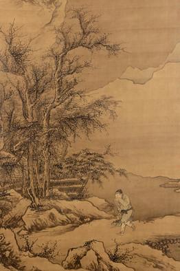
Yet there is the danger of getting so carried away deciphering content that we forget to experience these works as art. Indeed, one of the show’s greatest pleasures is its variety of forms, each inviting a distinct approach. The verticality of hanging scrolls like “Palace Banquet” guides the eye from bottom up. We stand outside looking in, slowly piecing the scene and story together. It is similar to the way we approach “Returning Home Through the Snow” (c. 1455), except that in Dai Jin’s hanging scroll we enter the picture through a single figure. We take in his downcast eyes and furrowed brow and, in the artist’s quick brushstrokes, we feel the winter wind whipping his thin robe. As our eye moves up to tree branches outlined in snow, to an expanse of empty sky and distant bare mountains, the chill of this man’s lonely walk engulfs us.

By contrast, other hanging scrolls feature tiny, anonymous figures that draw us inside the scene. We climb the mountain path that stretches before them, glide along the twisting river, brush against low-hanging branches, feel our heart rate slow as we marvel at the scenery. This is similar to the way we experience horizontal handscrolls. One of the oldest forms of painting in China, they are meant to be unfurled from right to left. Short scrolls can be viewed in their entirety, but the long ones—of which the show offers fine examples—invite us to journey through them in stages, each about an arm’s length.

Since no museum could ever allow us to actually do that, we have to emulate the experience by blocking our view (hands up like blinders on a horse works—don’t worry, nobody is looking). When we experience Zhao Cangyun’s “Liu Chen and Ruan Zhao Entering the Tiantai Mountains” (late 13th-early 14th century) this way, we discover just how clever Zhao’s composition is. Like all handscrolls, his begins with an expanse of beautiful silk. This is the “moat,” whose purpose is akin to that of sorbet between courses—it cleanses our mind of whatever occupied it before. First comes a block of text, which a label beneath helpfully translates. It relates the tale of two men who set off to gather medicinal herbs; we next see two elderly gentlemen, a basket to the ready. For two more scenes, text precedes image, priming us for the sight of “green peaks, lofty and contorted” and a stream in need of crossing. We watch the men wade in—then, suddenly, in the next scene, two beautiful women appear on the opposite bank. This time, Zhao has delayed the explanatory text, so we share the men’s surprise.

This way of engaging handscrolls also brings out the beauty and power of nonnarrative paintings. A seemingly repetitive composition like Wang Yuanqi’s 1711 “Wangchuan Villa” morphs into discrete scenes of startling variety. Meanwhile Fang Congyi’s 14th-century “Cloudy Mountains” begins with a geology so vibrant it seems to still be shifting. Yet as we move forward, diagonal lines propel us on a journey that paradoxically builds in intensity even as the landscape’s details dissolve into mist. By the time we reach the expanse of space at the end of the painting, some deep part of us registers what our eyes can’t see: that there is form in this emptiness.

On a lighter note, we can’t help but imagine how the rhythmic waving of a fan might animate trees and birds painted on its surface. Or visualize how the play of light might bring alive deep carvings on a wood brush-holder or ivory table screen. Or contemplate how revealing the album format can be. Wen Zhengming’s ostensibly modest “Garden of the Inept Administrator” (1551) forces viewers to savor, page by page, his poetry, calligraphy and painting. The Met even provides the perfect setting for such musings: the adjoining Astor Court, modeled after a 17th-century Chinese garden, complete with mock pavilion, greenery and evocative rocks.

"A Rothko Fills a Museum's Breach" @wsj

The Crystal Bridges Museum of American Art in Bentonville, Ark., opened last November to good reviews—mostly. But some critics zoomed in on a big failing: the absence of top works by artists of the postwar period, when American art marched to the front of the international stage.

image
Crystal Bridges Museum of American Art

Mark Rothko's 'No. 210/No. 211 (Orange).'

Now Crystal Bridges, lavishly financed by Wal-Mart heir Alice Walton, has filled one major gap with the purchase of a 1960 painting by Abstract Expressionist Mark Rothko, "No. 210/No. 211 (Orange)." An example of his most prized works, it has been shown publicly only twice and has been in a private Swiss collection since the mid-1960s. "Each orange has a different glow—it's very vibrant," says museum director Don Bacigalupi.

He declined to disclose the price tag, but Marc Glimcher, president of Pace Gallery, pegged it at about $25 million.

Rothko works have been selling well. One of Sotheby's anchors in its big New York fall auction series will be the 1954 "No. 1 (Royal Red and Blue)," which it expects to sell for at least $35 million. Last May, his fiery "Orange, Red, Yellow," from 1961, fetched a record $86.9 million at Christie's, way past its high presale estimate of $45 million. Crystal Bridges looked seriously at that painting, though Mr. Bacigalupi declined to say whether the museum bid. When the opportunity to buy "No. 210/No. 211" came along, in a private deal brokered by Christie's, the museum jumped. (The unusual numbering is Rothko's own.)

The public will first see the painting on Oct. 13, at the opening of a special exhibition, "See the Light: The Luminist Tradition in American Art." The show focuses on artists' use of light, starting with the mid-19th century landscape "luminists" and continuing through American Impressionists and modernists like Rothko and Dan Flavin to contemporary artists like James Turrell. When that show closes on Jan. 28, the Rothko will join the permanent-collection galleries.

Mr. Bacigalupi says that he'll use the Rothko purchase as an opportunity to rethink the display of the museum's postwar galleries. In fact, they and other galleries have already changed since the opening, as the museum has added works. They include an early glass sculpture by Dale Chihuly; paintings by Thomas Hart Benton, Theodore Roszak and Miriam Schapiro; and a collection of 466 American prints and drawings that includes images by Edward Hopper, Rockwell Kent, Reginald Marsh, Charles Sheeler and James Abbot MacNeill Whistler, assembled over 30 years by a European.

—Judith H. Dobrzynski

"Museum Park’s vaunted plan shrinks as Miami deals with fiscal crunch" in @miamiherald via Notes from the Bass Museum - George Lindemann Jr

Posted on Sun, Sep. 16, 2012
BY ANDRES VIGLUCCI
aviglucci@MiamiHerald.com
   The new Miami Art Museum building is on budget and on target for a fall 2013 opening, but the long-promised park to go along with it has fallen victim to the city's financial crunch.
EMILY MICHOT / MIAMI HERALD STAFF
The new Miami Art Museum building is on budget and on target for a fall 2013 opening, but the long-promised park to go along with it has fallen victim to the city's financial crunch.

More than four years ago, the city of Miami eagerly embraced an ambitious scheme for the park portion of the mega-million-dollar Museum Park project on the bay in downtown Miami.

Unanimously approved by the City Commission, the plan for a $68 million, 20-acre green space was supposed to turn most of near-derelict Bicentennial Park into Miami’s version of Chicago’s celebrated Millennium Park. The vision: lure thousands of visitors with lush public gardens, a dramatic entrance on Biscayne Boulevard with rows of royal palms growing out of a shallow pool, a great lawn, glass pavilions and a sculpted mound to provide visitors sweeping vistas of water and greenery.

Well, scratch all that. At least for the foreseeable future.

Facing a daunting fiscal crunch, city administrators have drastically scaled back the long-delayed park plan to a roughly $10 million basic blueprint. City officials have put aside most of the park’s distinctive features until an undetermined future date to focus on building two key if also simplified elements: a new baywalk, and a promenade from Biscayne Boulevard to Biscayne Bay that will provide pedestrian access to the art and science museums now rising on Bicentennial’s north end.

There will still be a park with trees, sod and pathways between the promenade and the deepwater boat slip that marks the project’s southern boundary, city leaders pledge.

It just won’t be anything like the elaborate plan that the city paid the New York firm of Cooper Robertson & Partners, famed planners of Battery Park City on Manhattan’s lower tip, $4.2 million to design.

“It will be trees and open space,’’ said city Commissioner Marc Sarnoff, chairman of the Omni Community Redevelopment Agency, which is funding the bulk of the park project. “You will be able to walk around, take a nap under a tree, play soccer. But it will not have that Millennium identity.’’

‘Still the vision’

Sarnoff and city administrators, who are now weighing five bids from contractors for the baywalk and promenade, say the reduced scope of work will include some needed environmental remediation to cover contaminated soil as well as basic infrastructure so that the Cooper Robertson plan can some day be realized.

“That’s still the vision our commission has embraced, although it was a few years ago,’’ said assistant city manager Alice Bravo. “We’re putting in the bones. We’re going to have an aesthetically pleasing park that will be in harmony with the museums and over time can be enhanced further.’’

The city had previously, and quietly, discarded some costlier elements of the Cooper Robertson plan, including a planned underground parking garage and a restaurant, reducing the estimated cost to around $45 million.

But the decision to scale back the park plan much further comes as the $220 million art museum building reaches the halfway point in construction, on schedule for a fall 2013 opening. The new Miami Science Museum, due for completion by the end of 2014, broke ground in February.

The museums, which occupy about eight acres just south of the ramp to the MacArthur Causeway, have their own extensive landscaping plan by Miami’s ArquitectonicaGeo. So will a broad plaza between the two museums that is being designed by James Corner Field Operations, the New York firm that collaborated on the wildly popular High Line, the abandoned elevated rail line in lower Manhattan that was converted into a linear park.

But Miami Art Museum leaders say they’re worried about what the downsized city park will look like, and whether it will be ready in time for their grand opening, scheduled to coincide with the arrival of the international art hordes for the Art Basel/Miami Beach fair in early December 2013. They’re especially concerned about the critical promenade, without which they say the museum could not open.

Their worst fear: Having an unfinished mud pit at their doorstep just when they have the attention of the international art world. Almost as bad, they say, would be a bare-bones park that detracts from the impact of their lavish new building, designed by the Swiss architecture firm Herzog & deMeuron.

“We remain very concerned about the quality of the overall scheme,’’ said MAM director Thom Collins. “Think about it. The park could be such an incredible amenity. This is the last parcel in that crown of downtown waterfront. It should be a real jewel. Our building is going to be beautiful. The plaza will be incredible. Our immediate landscaping will be beautiful. But what will happen south of there is in question.’’

Aside from plans for the simplified baywalk and promenade, the city has released no plans or renderings of the scaled-down green space, nor issued any descriptions of its scope. No work is apparent at the park.

Fiscal reality

Several mature trees, uprooted from the site of the Brickell CitiCentre project, were recently moved to the park by the developer, Swire Properties, and clumps of Bicentennial Park trees survive. But the center of the park space — used for special events like the Cirque du Soleil tent — remains a bare, treeless desert.

Sarnoff said the scaling down answers the city’s fiscal reality.

The Omni CRA special taxing district, which was to finance the full-fledged Cooper Robertson park, saw revenues drop significantly during the economic crash and has yet to fully recover, he said. The agency is also now on the hook to repay a $45 million loan the city took out to cover its share of the under-construction PortMiami tunnel, leaving relatively little cash for the park, he said.

The bulk of the baywalk is being financed by the Florida Inland Navigation Board, a special taxing district that pays for improvements along the state’s coastlines and financed reconstruction of the site’s seawall. The Omni CRA, meanwhile, is contributing about $5 million toward the park.

The Museum Park plan, including the new homes for the art museum and the science museum, was a cornerstone of former Mayor Manny Diaz’s efforts to revitalize downtown Miami. The museum buildings are being funded through a combination of Miami-Dade County bonds and private donations.

The park portion was included separately in the so-called mega-plan that Diaz negotiated with Miami-Dade County to simultaneously finance the PortMiami tunnel, the new Miami Marlins stadium and affordable housing in Overtown, using in part revenue generated by the Omni and Overtown CRAs. The tunnel is halfway done, the stadium is open, and the Overtown CRA is set to consider a plan to issue $50 million in bonds to subsidize several new housing developments in the historic but impoverished black neighborhood.

Some wonder if the promised park will ever materialize.

“It’s a shame, really,’’ said Science Museum director Gillian Thomas, whose building is scheduled for completion a year after the art museum is done.

Thomas said the city’s piecemeal approach is reasonable given the fiscal constraints it faces. In any case, she added, she is not a fan of some aspects of the Cooper Robertson park plan, singling out the palms-in-the-pond element.

“This approach creates a nice canvas, with quite a good frame with the waterfront and promenade,’’ Thomas said, adding: “It’s such a lovely spot. I’m sure long-term there will be a fabulous plan. Whether it’s the Cooper Robertson plan or some other plan is open for discussion.’’

Corporate support

But she said an artfully designed park along the lines of what the city originally promised is essential to the success of the broader Museum Park project, whose goal was to attract thousands of people to a stunning but sorely underused corner of downtown Miami.

A park with features such as interactive installations would likely attract numerous visitors independently of the museums, she said, just as art-filled Millennium Park, which was built over an old rail yard next to the Chicago Institute of Art and the home of the Chicago Symphony, sharply boosted tourism to that city’s downtown Loop.

Making that happen at Museum Park, however, may now require donations or corporate support, possibly through the formation of a park conservancy like that established for Central Park in New York, Thomas said.

Tax revenues are also sure to rise at the Omni CRA in coming years, especially if Malaysian casino giant Genting builds a planned resort on the site of The Miami Herald’s building, which it bought from the newspaper company.

“If you have a fabulous park, you get even more people down there,’’ Thomas said. “It would be great for the city and it would be a sensible thing to do, but they would need to find the cash.’’


© 2012 Miami Herald Media Company. All Rights Reserved.
http://www.miamiherald.com

via bassmuseumpres.tumblr.com